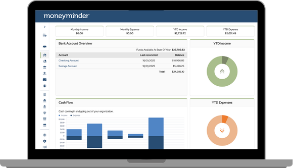
We’ve rolled out an update to your dashboard that makes it even easier to understand your group’s financial picture at a glance.
Start at the top with four clear information cards that show:
- Income this month
- Expenses this month
- Year to Date Income
- Year to Date Expenses
You’ll also love the new visual charts that compare your actual income and expenses to what you’ve budgeted for the year—a simple, powerful way to see how your group is tracking.
Access your bank accounts, cash flow over time, and financial overview when you need a closer look. Don’t forget to change your financial year to view prior year’s data.
This update is designed to help treasurers stay organized, confident and in control—from the moment they log in.
Posted in Feature Releases
The changes in report formatting, effective with this upgrade, have made the reports I provide to board members harder to understand. The abandonment of shading…why?
Hi Dave,
We appreciate your feedback. I will add your feedback to our feature requests.
Is this update why my Treasurer’s report doesn’t the lines with color now?
Hi Karen, yes, that is part of the update. However, we’ve received feedback from a number of customers, and we plan to add color back to the reports.
Any option to enable us to move the card components around? The graphics are less important to me than the Financial Overview and I’d like to move that up top with the Banking overview.
Hi Mary,
That option isn’t available at this time; however, the ability to customize the homepage has been discussed.
I will enter your suggestion into our feature requests. We appreciate your feedback.